Product Strategy
How McDonald's Engineered Its Self-Serve Kiosks to Increase Revenue Without Changing the Menu
McDonald's didn't redesign the menu. They redesigned the buying decision — engineering a kiosk that quietly increases average order value on every visit.
12 min read
·
UX, Behavioral Psychology, Product Marketing

McDonald’s didn’t redesign the menu.
They redesigned the buying decision.
How do you increase average order value without increasing menu prices?
The Business Problem
McDonald’s runs on thin per-item margins at enormous volume. Raising menu prices risks visible backlash and traffic loss. The business needed a lever that increases revenue per visit without touching the price tag customers see first.
Revenue
Orders
Average Order Value
Upsells
Profit
Chapter 1 — The App Isn’t the Product
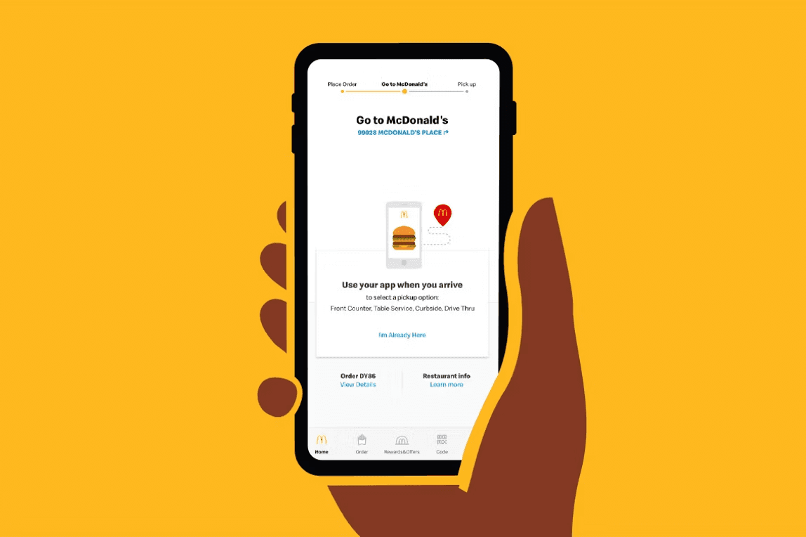
The McDonald’s app looks like a convenience play — order ahead, skip the line. It isn’t. Every download is a CRM acquisition event. Once a customer creates an account, McDonald’s gains a persistent identity to personalize offers, track visit frequency, and re-engage through push notifications. Convenience is the hook; loyalty and retention are the product.
Chapter 2 — McDonald’s Organizes Around Intent
🍔
I'm Hungry
Full meal browsing, organized by craving.
☕
Coffee
A dedicated fast lane for a completely different mission.
👨👩👧
Eating Together
Group ordering that surfaces shareable, higher-ticket items.
🥤
Quick Drink
A minimal path for the lowest-commitment visit.
This isn’t a category menu — it’s an intent router. Instead of forcing every visitor through the same decision tree, the kiosk asks what job the customer is here to do, then reduces the cognitive load of everything after that first tap.
Chapter 3 — System 1 Thinking
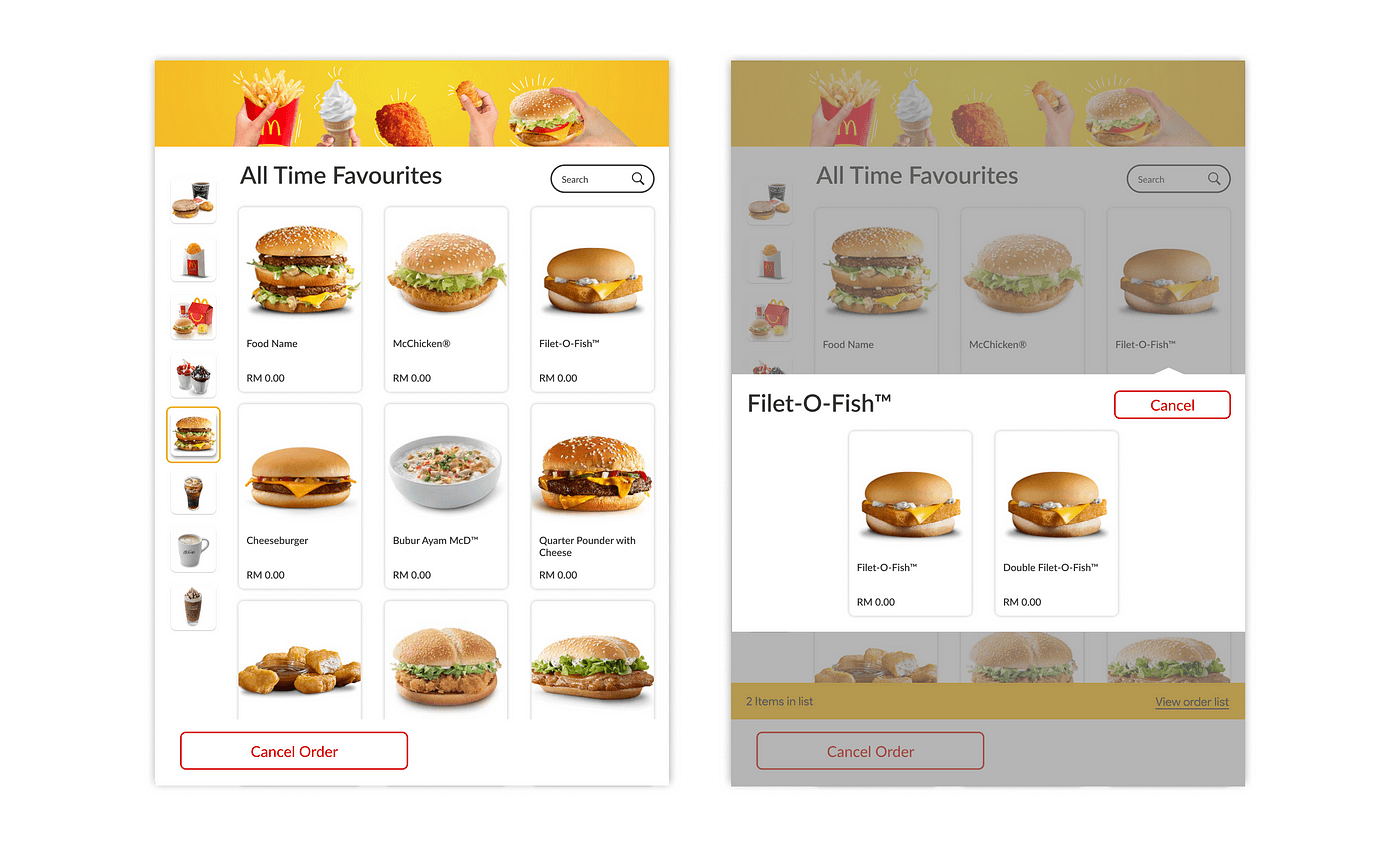
Traditional Menu | Kiosk |
|---|---|
Text-heavy | Visual-first |
Compare prices | Choose visually |
Rational | Emotional |
Chapter 4 — Calories vs Conversion
Restaurant Menu | Kiosk |
|---|---|
Calories and nutrition prominent | Imagery and combos prominent |
Designed for transparency | Designed for conversion |
Slower, deliberate reading | Fast, visual scanning |
Chapter 5 — Meal Upgrades
Burger
Meal
Large Meal
Dessert
Drink
Higher Basket Value
Each step in the ordering flow is a soft upsell disguised as a natural next question. No single prompt feels aggressive — but the cumulative effect on basket size is significant.
Chapter 6 — Choice Architecture
Small
The anchor — makes every other option look like more value for less relative cost.
Medium
The default the interface visually favors — framed as the 'smart' choice.
Large
The premium anchor that makes Medium feel modest by comparison.
This is classic anchoring and framing: the presence of Large makes Medium feel reasonable, and the presence of Small makes Medium feel generous. No single size is inherently persuasive — the set is.
Chapter 7 — Checkout Psychology
Checkout
Upsells
Impulse Purchase
Higher Revenue

Chapter 8 — Removing Social Friction
Cashier | Kiosk |
|---|---|
Judgment: visible to others in line | Judgment: private, no audience |
Privacy: order spoken aloud | Privacy: fully self-contained |
Customization: verbal, effortful | Customization: tap-driven, low effort |
Upsells: dependent on staff training | Upsells: consistent, every single time |
Speed: variable by staff and line | Speed: consistent, self-paced |
Business Impact
Kiosk
Faster Ordering
Higher AOV
Lower Labor Costs
Higher Throughput
Higher Profit
Product Manager Lens
Supporting Metrics
Meal Upgrade Rate
Dessert Attach Rate
Checkout Completion
Order Time
Revenue Per Visit
Product Marketing Lens
Feature — Self-serve touchscreen ordering
Benefit — Order exactly what you want, at your own pace
Value — A faster, more personal way to order
Business Outcome — Higher average order value, every visit
If I Were the PM
Personalized upsell prompts
Hypothesis
Order history predicts which upsell converts best per customer.
Expected Impact
Higher meal-upgrade and dessert attach rates.
Success Metric
Attach rate lift vs. control group
Dynamic choice architecture
Hypothesis
Reordering size/combo defaults by daypart increases relevance.
Expected Impact
Higher AOV during breakfast vs. dinner dayparts.
Success Metric
AOV by daypart
Social-proof nudges
Hypothesis
Showing 'popular combo' badges increases perceived safety of upsell choices.
Expected Impact
Higher combo attach rate with lower decision time.
Success Metric
Combo attach rate, time-to-order
Reduced-friction customization
Hypothesis
Fewer taps to customize increases completion of higher-value custom orders.
Expected Impact
Fewer abandoned customizations mid-order.
Success Metric
Customization completion rate
Post-purchase loyalty nudge
Hypothesis
Prompting app download after a large kiosk order captures high-value customers into CRM.
Expected Impact
Higher app adoption among high-basket customers.
Success Metric
App signup rate post-kiosk order
My Product Take
McDonald’s didn’t build a better ordering system.
They built a better decision-making system.
What impresses me most is the restraint: nothing about the kiosk feels aggressive in isolation. Every individual prompt is small, polite, easy to decline. The persuasion lives entirely in the architecture — the sequence, the defaults, the visual hierarchy — not in any single dark pattern.
If I owned this product, I’d push further into personalization: dynamic defaults based on order history and daypart, and a slower rollout of AI-suggested combos framed as convenience rather than upsell. I’d also watch closely for upsell fatigue — the same mechanics that lift AOV today can erode trust if pushed too far, too often.